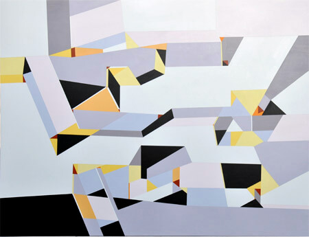
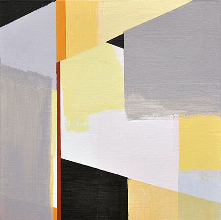
painting + installation projects
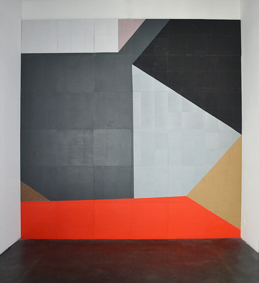
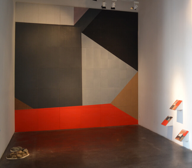
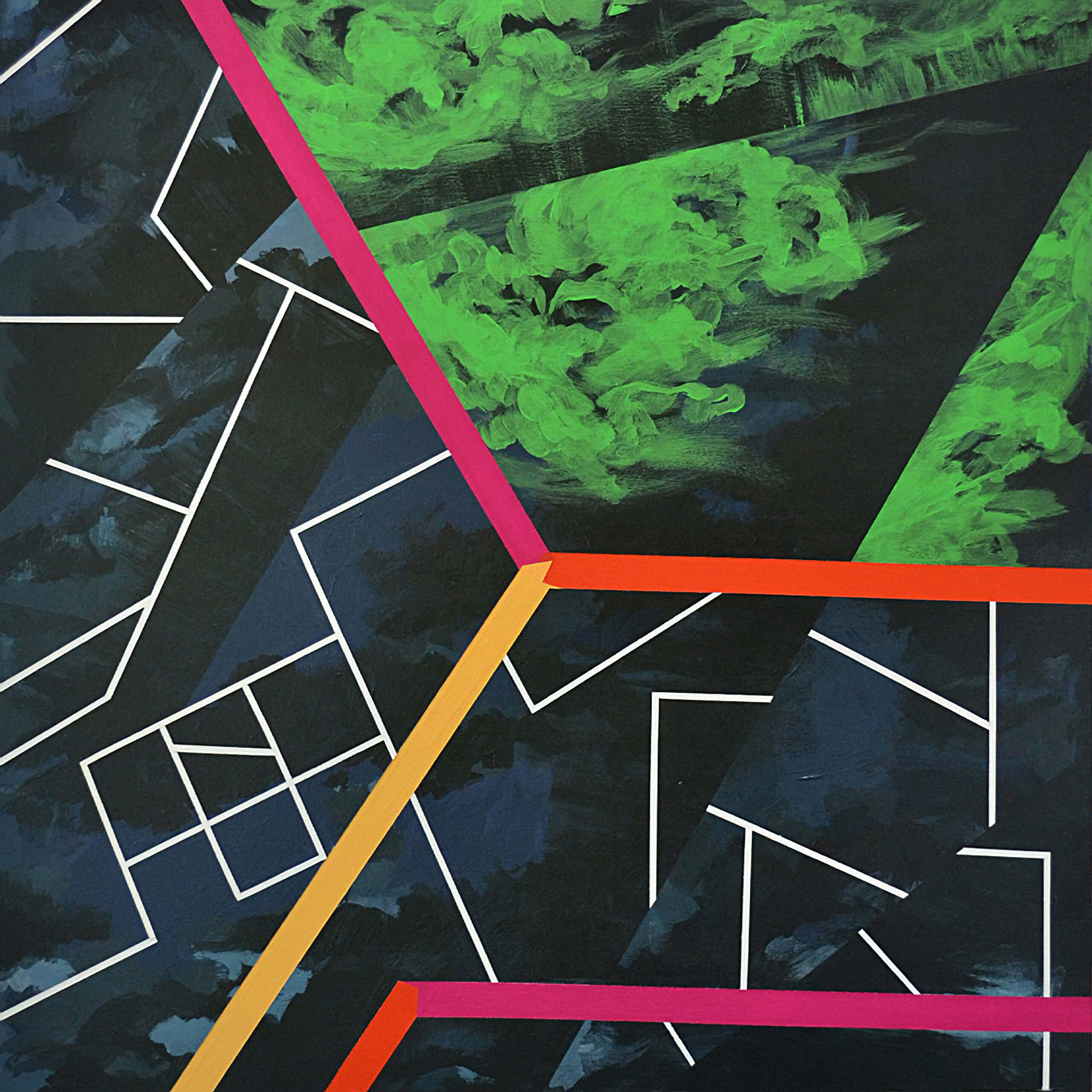
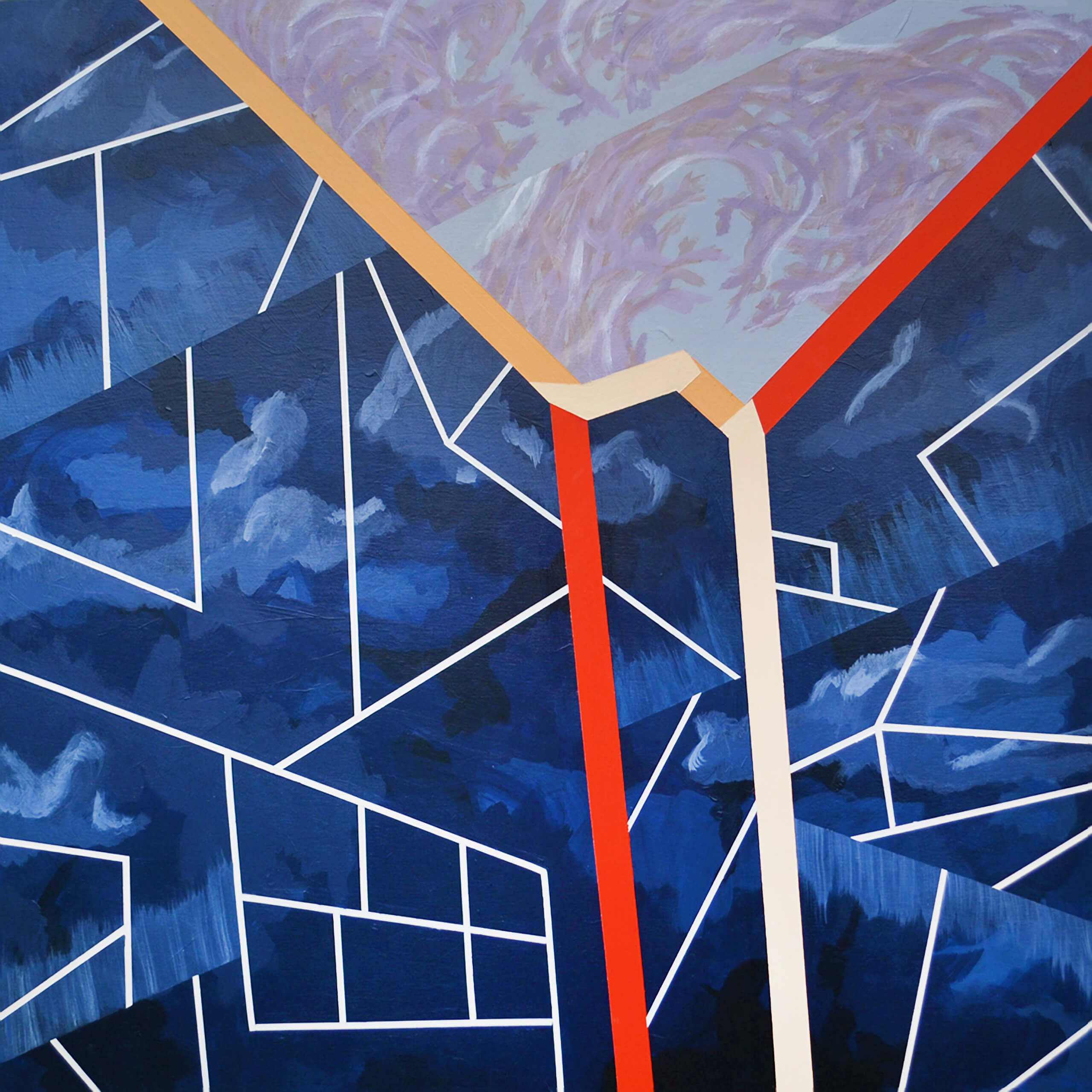
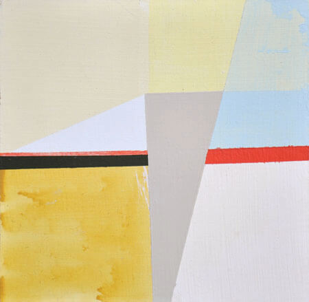
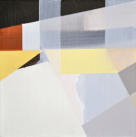
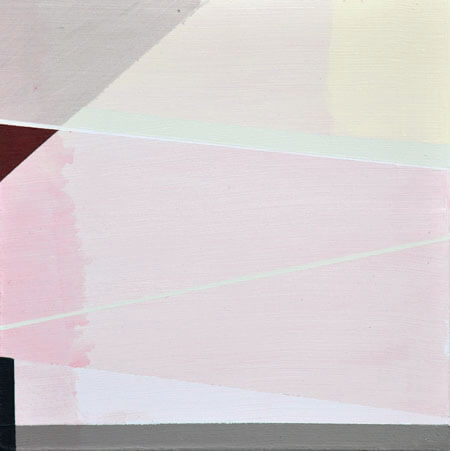
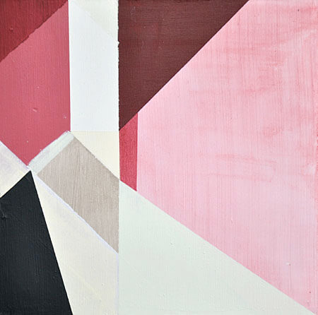
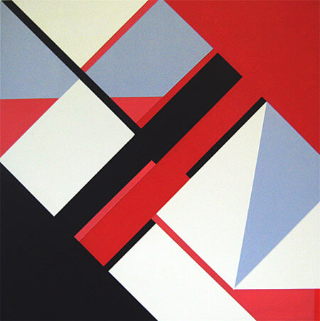
^ Geometric Landscapes, 2013, mixed media.
2014 - Interview by Associate Curator Museum of Contemporary Art in Santa Barbara, Brooke Kellaway
When you relocated from Buenos Aires to Santa Barbara about ten years ago, what kind of work were you making?
I was working at a graphic design studio full-time, but also making small-sized photocopied short graphic novels that I gave to friends, and I was painting fictitious logo-like shapes on wood inspired by sci-fi books, plants, and animals.
How did this way of abstract painting inform the direction of your work?
I think it was a progression, the logo-like paintings were geometric interpretations of something I'd see in nature, stripped of details, almost to the point of abstraction influenced by modernist illustration. This led me to learn about California hard-edge and color field painters. Getting to see in person works like Helen Lundeberg’s paintings from the early 1960s, made me pay more attention to the geometry found in architecture.
At what point did architectural references begin to enter your work?
In 2006 I started a series of works called “Shady Nooks”, bright-colored geometric paintings based on collages of digital photos of dark everyday architectural, forgotten corners. I think the advent of digital photography, and its economy, made me take tons of photos of how light interacted with architecture.
Where were some of the locations that interested you?
Mostly corners, ceilings, roofs, stairs, and windows that I would see almost every day, that represented my visual and body relation to surrounding geometry and that were sculpturally interesting. My studio at the time was in an industrial area. There I had the thought that “utilitarian” architecture usually had more asymmetry and irregular shapes since sometimes the roofs and walls were built to fit the machinery inside.
I’m interested in how the eye reads three-dimensionality. I like how sometimes architectural shapes cause the eye to waver between reading a 3D space as protruding or coming at you, or receding away from you. I often play with transitions from 3D to 2D plains and vice versa.
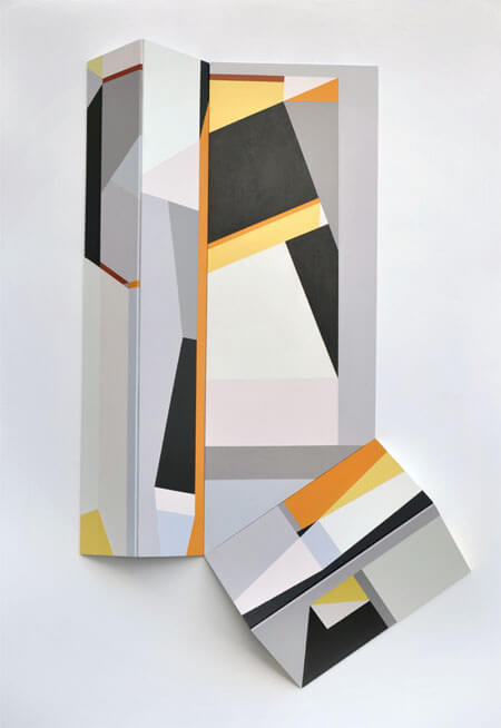
This immersive installation, Geometric Landscapes, in which you covered the entire wall with panels, placing sculptures on the adjacent wall, and a few on the floor, was a real departure from the acrylic on wood board paintings you were making prior. What prompted the shift into creating a phenomenological space for your MCASB exhibition?
Prior to this exhibition, I began making sculptural paintings and bigger works. Covering one whole wall of the museum was prompted by being backed by an institution like MCA that promotes experimentation, I wouldn’t have been able to afford to build the works otherwise. Also, the shift was nurtured by being in close conversation with curator Miki Garcia; getting acquainted with the works of Wade Guyton, Tobias Rehberger, and Jorge Pardo; and having studio visits with artists like Mario Ybarra Jr. and Molly Smith. All these experiences, made me think about ways of challenging the hierarchy of eye-level hung traditional painting and making the work envelop the viewer to create a body experience.
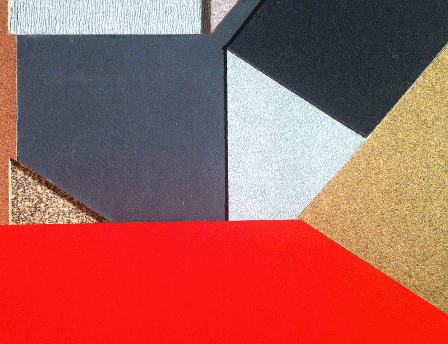
For Shield #A1-F6 this idea of immersion was also partly influenced by “Perky Pat layouts” from the sci-fi Philip K. Dick’s dystopian science-fiction novel, The Three Stigmata of Palmer Eldritch (1965). These physical props/layouts were intended to simulate a sort of alternate reality where life is easier. In developing the Information Display works, I was looking for objects in public spaces that visitors had a physical interaction with. While walking up to info displays at parks, I got interested in how the tilted 45-degree angle on those displays favored legibility over the protection of the object, or the elevation of its status. The Minus 7200 Grit sculptural paintings on the floor are inspired by the macrophotography of sandpaper.
In your day job as a graphic designer, your primary tools are those that are used in the virtual realm, where it's possible to build a world seen from infinite perspectives (sizing, skewing, rotating), separate from that in which the labor of construction occurs – in which one finds the tools of the carpenter, such as sandpaper. With the works in Geometric Landscapes, could you talk about combining these toolsets?
I have a love-hate relationship with certain aspects of technology in general. I feel that computers are great tools, however as a graphic designer sometimes I am forced to overuse them. This is why working with my hands, on a physical object is really important for me, however, using the computer is also part of my process.
I like the materiality of the sandpaper, and that it’s a basic, functional, and necessary object used in construction. Cutting it, gluing it, moving it around, using actual tools—a knife and a ruler balances the work I do on a computer. It’s really different than working in Photoshop—using tools like virtual scissors and never physically grabbing a ruler.
The title of the large wall piece, Shield, in part stems from separation, or distance, from virtual tools and screens and pixels. The virtuality of being in the computer and seeing things in the world as these machines present them to us, versus seeing the actual thing can be really confusing. There is a "matter-of-factness" of an actual object versus its representation in the virtual world where it seems that it could be made up, and there’s no empirical proof of it.
When I made this work I was looking at a lot of aerial photography. One day I noticed a pile of sandpaper scraps on my studio floor, and seeing the shapes and color interaction between the different scraps, made me associate this experience with looking at rooftops on Google maps, which made me think about how looking at things from above has this distinctly different quality.
The roof reference was also informed by Dick's novel mentioned above. He writes about a future where the temperatures are so hot that people are forced to live exclusively under roofs. By reading that sci-fi I found a relationship between the way these writers speculate on the future, and the speculation that’s involved in the creative process—you have this idea and you go a little further and see how far you can take it. For me, it has something to do with not trying to make sense as much as exploring creativity.
Can you talk about how your work deals with perceptions of scale?
I think it goes back to being a kid, looking at window displays at travel stores and architects' offices, and being fascinated by scale models of buildings and airplanes.
I’d look through the windows and see these miniature worlds. There is something that is really interesting to me, about how we measure everything because of the range of our eyesight and the size of our bodies; how all of the things that surround us are based on our size and scaled to a certain ratio. This perception then changes when you see something from above, like from a plane, or when you see an architectural model.
Reading Carl Sagan, learning about Bucky Fuller’s ideas on cosmological geometry, and watching Charles and Ray Eames’ The Power of 10 films made me think about how relative sizes are in relationship to the cosmos, and also about how, when I create a geometric shape, that instantly creates a relationship to everything that surrounds it. I’m interested in that aspect of geometry, where one thing is within another, which is inside another, and so on. With a map for instance, there’s a house that’s within a street, that’s within a neighborhood, city, a country, and continent. I like that connectedness that geometry makes clear to me. Like all things being part of a bigger scheme.
What are some questions related to your work that keeps coming up in the community of artists that you’re a part of, and that motivate you?
People’s relationship to their surrounding space. There’s a current necessity, or reality, of electronic devices knowing where you’re at, at all times. When you look at places through Google maps, you know where you’re at in the world. We think we know where we are but if you think about it cosmologically it all comes down to pieces again. These are ongoing questions—how we are surrounding ourselves, where we’re at, how we are looking at things. It has to do with perspective —are we taking enough distance from things, are we looking at them close enough? I think that’s the philosophical side of working with scale or perspective that comes up in conversation, and interests me the most — seeing the magnitude of things in a way that challenges my ideas of real and virtual.


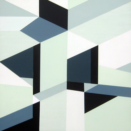
^ Corners and skies. 2013-18, mixed media.
Observing indoor architectural corners made me think about the air and space between those walls, roofs, and or floors. I imagined the air being connected, through air, to that contained in other possible rooms within an imaginary building, and to the sky outside, to outer space and infinity. (In the fourth image, the metal sculpture is a collab with Joe Shelton)

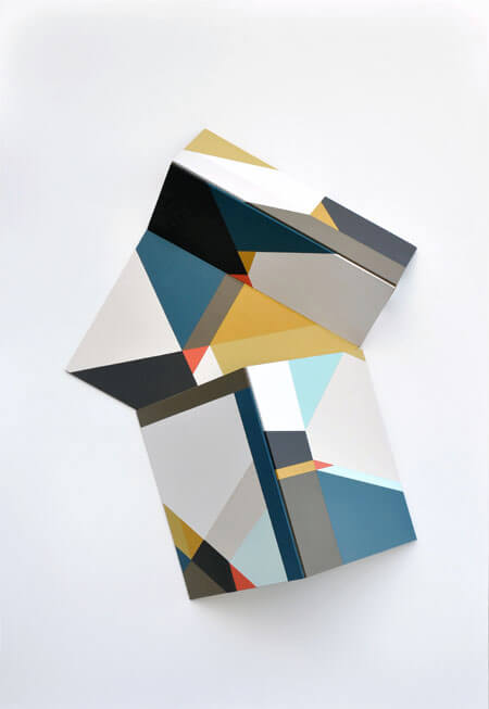
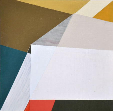
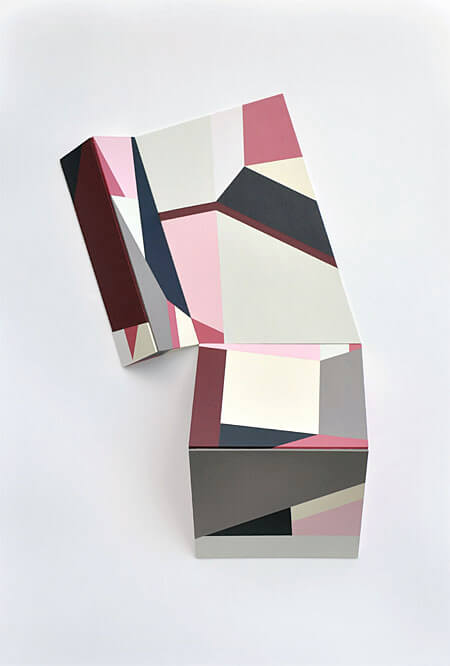
^ Simple Folds


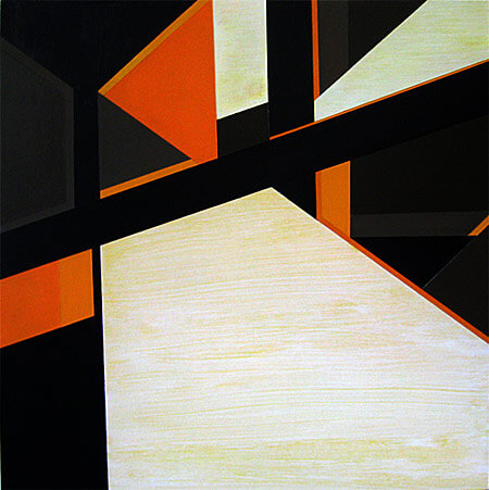
^ Colorfields. Sand, Ocean, and Kelp.
The works are inspired by the detailed observation of natural and man-made surroundings, and by exercises found in Josef Albers' book Color Interaction. Deceiving shapes inspired by aerial architecture photography generate ambiguous spaces which house notions about the dynamic subjectivity of color.
(Tents) Tent-like sculptural paintings where two-dimensional shapes are recopied from previous work, playing with the idea of self forgery and originality. Color palettes are also borrowed from previous work and are adapted to the new environment. Shadows mark material existence.
(Realization Time) Color studies for Colorfields series.
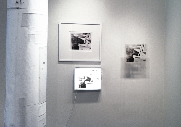
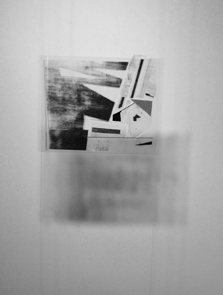
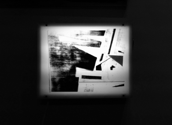

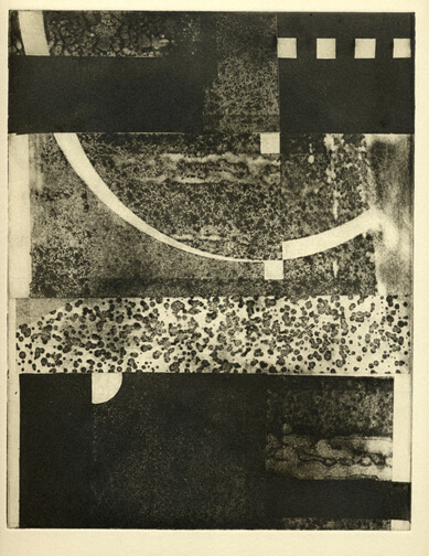

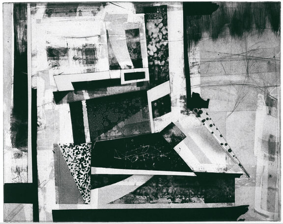


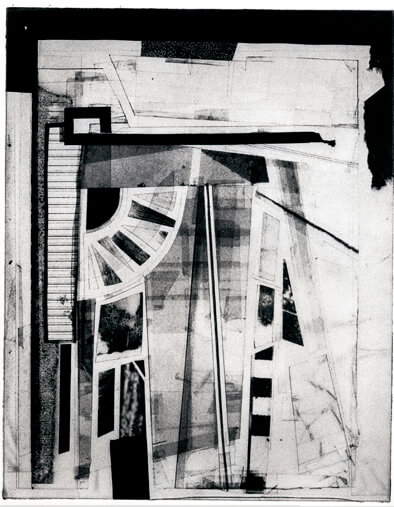

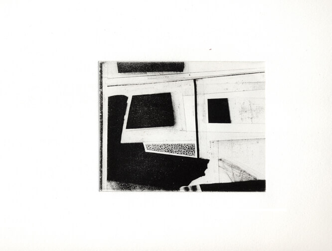

^ Lightworks, apophatic folly. 2007-2013
Collages of transparent and opaque plastics create hallucinatory architectural landscapes. The experimental hand-pulled intaglio solar prints are footprints of those chimerical constructions. The title represents the enthusiasm of a hypothetical builder and is derived from an analogy between the process of solar printmaking and the concept of apophasis or affirmation through negation, a way of telling what something is, by telling what is not. In the case of printing black and white solar prints, the denial of solar light and ink will determine the look of the final experience.


^ Shady Nooks. 2008-10. Acrylics on 12” x 12” wood panels.
Formal hard-edge paintings are rendered from sketches inspired by architectural photographs of everyday objects: vehicles, household items, buildings and structures. Stimulating bright, contrasting colors from commercial products are applied intuitively as a comment on repetition and familiarity. They celebrate the creation of chimerical spaces through color interaction.